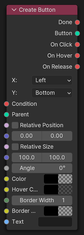
Create Button
Create an interactive button.
Parameters
- X:
Widget horizontal alignment
- Y:
Widget vertical alignment
- Text X:
Text horizontal alignment.
- Text Y:
Text vertical alignment.
Inputs
- Condition
If connected, condition must be fulfilled for node to activate.
- Parent
If connected, the created widget will be added as a child to this parent.
- Relative Position
If enabled, position will use a factor value (0-1) instead of pixels.
- Position
X and Y position of this Widget.
- Relative Size
If enabled, Size will use a factor value (0-1) instead of pixels.
- Size
Width and Height of this Widget.
- Angle
Widget tilt Angle.
- Color
Button color in normal state.
- Hover Color
Button color when mouse is hovering over.
- Border Width
Width of border line, in pixels.
- Border Color
Color of border line.
- Text
Text displayed on top of the button.
- Text Position
Text position in local button coordinates.
- Font
Graphical font to use for the button text.
- Font Size
Display size for the text.
- Line Height
Line spacing in factor (1.5 = 1.5 x Font Size).
- Font Color
Color of the button text.
Outputs
- Done
True if node performed successfully, else False.
- Button
Created Widget.
- On Click
True when Button is clicked.
- On Hover
True when cursor is hovering over this widget.
- On Release
True when Button was clicked and is released again.