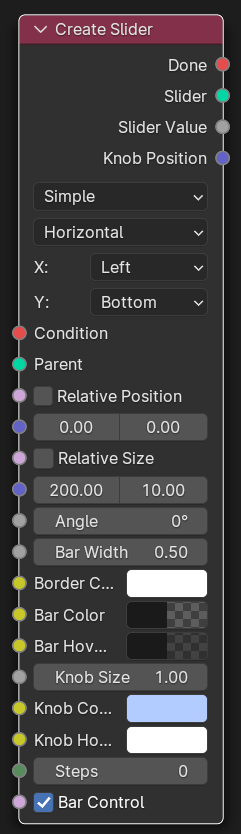
Create Slider
Parameters
- Type
Selected slider type.
- Orientation
Selected slider orientation.
- X:
Widget horizontal alignment
- Y:
Widget vertical alignment
Inputs
- Condition
If connected, condition must be fulfilled for node to activate.
- Parent
If connected, the created widget will be added as a child to this parent.
- Relative Position
If enabled, position will use a factor value (0-1) instead of pixels.
- Position
X and Y position of this Widget.
- Relative Size
If enabled, Size will use a factor value (0-1) instead of pixels.
- Size
Width and Height of this Widget.
- Angle
Widget tilt Angle.
- Bar Width
Width of the slider bar.
- Border Color
Color of the border.
- Bar Color
Color of the slider bar.
- Bar Hover Color
Slider color when in mouse-over state.
- Knob Size
Size of the control knob (only on some slider types).
- Knob Color
Color of the knob.
- Knob Hover Color
Color of the knob when in mouse-over state.
- Steps
If step functionality is required, i.e. slider moves by value of 10-20-30 etc. 0 (zero) will enable smooth value changing.
- Bar Control
If checked, clicking on the bar has the same effect as clicking on the knob.
Outputs
- Done
True if node performed successfully, else False.
- Slider
Created widget.
- Slider Value
Current slider value.
- Knob Position
Knob position in pixel screen coordinates.